---------------------------------------------------
Report on Visit to Woodcroft Wildspace
----------------------------------------------------
On Friday, June 8th, I visited Bob Ladell at the Woodcroft Wildspace. The visit mainly consisted on him telling me about upcoming
projects that the wildspace is going to do, and got more in depth
as to how he wanted the wildspace to be seen as. Those upcoming
projects include creating a 'sensory garden' with home grown vegetables
and of areas in which the community (ie a school) 'adopt' and plant
things. The other being the 'eco-gym' where it's basically a bunch of
logs / rope / etc that people can use to exercise with. I also gave him an overall
summary of some of my website ideas, but the
majority of the visit was him explaining and showing the new (from the
last time I went) developments of the site.
As well as
that, I inquired about the education aspect of the wildspace, since that
was the area which was the most blank for me. He gave me an example of
where a university student of biodiversity came to WW and basically did a
field project where in the end instead of Bob having to pay an expert
for a report on biodiversity, he paid for one day of the expert on the
site and from there the student took over making said report. He was
also very keen on Southgate College and the whole making sculptures out
of logs thing , but didn't really give much insight as to how they/we
could accommodate primary school children apart from the foregone
conclusion appealing to teachers. The way in which he visualizes the
education aspect coming together is through the old tennis court - which
he has called the 'open air classroom'. Overall I gathered it was very
much a give and take ethos, which I think hasn't really been
demonstrated beyond talking in my opinion.
The main thing that I gathered from visiting is that more than
anything I need to focus on the visual aspect of the place where there
is virtually none. There is still a problem with signage, my dad drove
me down and that's the one thing he immediately commented on. What I am
pretty much convinced on, following my visit, is that I should focus on
creating a unified visual stock for Woodcroft - such as making templates
for posters or leaflets and redesigning the website background /
buttons / banner / footer. advertising the projects I mentioned earlier -
and then work towards creating a system in which this could be
implemented as a secondary objective. Visiting Woodcroft really
refreshed the ideas I had in my head, as well as gave some perspective
as to how much there is to do and how having outdated information on the
website is really hindering them.
-----------------------------------------------------------
Research results of website design and fonts
-----------------------------------------------------------------
http://vandelaydesign.com/blog/galleries/30-nature-inspired-websites/
http://www.experiencialecom.com.br/experiencialecom/Portugues/ - background is a square texture repeated
http://efficaxenergy.com/en - photograph as background
http://www.goateejoe.co.uk/ - stylized photo background
http://www.whitelotusaromatics.com/ - combination of background colour and background image centered
http://greenglobeideas.com/ - plain background, image for header
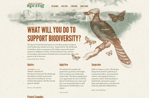
http://www.themusichall.org/ - overall website design
https://www.redbrickhealth.com/ - picture background without white table.
http://www.webanddesigners.com/wp-content/uploads/2011/08/nature-inspired-websites/web-design-nature-inspired-7.jpg - - I really like this
http://www.huxleyprairiefest.com/ - website considering of header image, background image, and footer image in a horizontal fashion
http://www.giselejaquenod.com.ar/blog/ - I like the illustration style which would be useful in the kids section
http://www.smashinginteractive.com/#work - a website in which all of the content appears on one page. Useful for formatting the kids section
http://www.from-the-couch.com/ - vertical navigation box
http://www.glass-tiger.com/index.php - box colours appear on highlight, opacity boxes good for photographic background
http://www.yellowoodstore.com/ - word colour appear on highlight, no boxes, good for simple background websies.
http://www.kidsfront.com/ - young children activities
(gonna need more research / discussion to find out what to do for primary school children)
Font selection: initial looks
http://www.dafont.com/multicolore.font - neat font, semi professional looking
http://www.dafont.com/biko.font * - friendly font, casual looking
http://www.dafont.com/alegre-sans-nc.font - Bold looking, strong font
http://www.dafont.com/blue-highway.font - a mixture of the first wo
http://www.dafont.com/fontastique.font - a curvier casual looking font
http://www.dafont.com/headline-hplhs.font - a font that could be used for advertising, to grab attention in stereotypical fashion
---------------
Category notes for the website
--------------------
Old Categories
Home -> Should act as a summary of Woodrcoft Wildspace
Project } Project and Siteplan should be combined: Who / What / Where / How?
Site Plan }
Photos -> Ambivalent: Split into project / gallery (new category)
Trees } What does this serve? Lacking direction / acting as filler. Can replace entirely.
Wildlife } If people want to know more information about these things they will seek it out for themselves
Events -> News should be on home page / In an archive (new category)
Newsletters -> Downloadable, in Archives
Friends
Sponsors
Support Us } All these pages should be combined into one - called community.
People
Contact Us
New Categories
HOME - Welcome to WW, Paragraph description, A 'show' of the best bits of Woodcroft (photograph montage), Most relevant news article linking to a read more section in the ARCHIVE.
PROJECT - About WW, site plan, development, area descriptions within WW with photograph, Visual representation of Wildlife and Trees (pages ditched from old categories)
COMMUNITY - friends, sponsors, support us, people, contact us, how to get involved
GALLERY - all photographs, resources from the community, kids drawings etc. Expanded showcase.
ARCHIVE - newsletters, past events and news, downloads, anything that doesnt fit in the above categories.
Possible new category being a page for the latest event in detail. Yet to decide.
----------------------------------------
Organizing Items and Assets for Woodcroft
----------------------------------------
What I need from Woodcroft:
Photography = Photos of the following (based off my notes)
AREAS: Apirary, Orchard, Wetland, Meadow area, Boggy area, Scrubland area, Open-Air classroom, Events area.
(this can also include photography of activities taking place in said area rather than them being standalone)
PEOPLE: Bob Ladell, Gary Garber, Amanda Ladell, Mary Askew
(I need to consult / email bob as to areas and people I may have missed that are as important)
The
reason why I need these particular things is that I wish to have visual
representation of the important aspects of woodcroft rather than just a
description. From my visit, the specific areas of woodcroft is the main
'selling' point of the place and thus is the main talking point. I plan
to take said photographs and photoshop them slightly so that they are
more presentation pieces rather than stock photography. If necessary,
I'll make another trip to woodcroft and take the photographs of the area
myself (though I'm not sure as to how I'd get a decent quality camera
at the moment)
For areas and people where I haven't listed photography,
I aim to produce 1 x conceptual area drawing, 1 x conceptual person drawing (basically blanks the photographs don't fill). The
conceptual area drawing can either be a standard piece to address
photography that doesn't quite fill the criteria by itself, or they can
be individually catered to each area - such as a drawing of a festive
events in the events area. I'm leaning more towards the latter, but
until I've finalized the design for the filler content it's still up in
the air as to which approach I'll take.
Testimonials / Quotes =
Comments about Woodcroft, of specific areas, of previous events, of
upcoming projects and partnerships, information / comments from the
volunteers who are regular, anything else that is relevant to the
promotion of woodcroft.
Most of this I can source myself, however there are instances
which I've spoken of with Bob that don't necessarily appear on the
website. I would really love to convert that atmosphere of friendly
conversation onto the website, and I plan to focus very much on the
interpersonal connections people / the community could get from the
area. I plan to utilize this by interspersing this into the text that is
already on the website with the usage of font size / colour to create a
hierarchy of what's the most critical to read from the website.
Tools / props that are available at the moment as well as what would ideally be there =
Some areas, such as the open air classroom and events, require for
there to be props and tools etc in order to be used by the community. I
would like to know what's already available so that I can make a list of
what I can do to fill perceivable gaps. Obviously I can't provide
physical items such as chairs and tables etc, however by knowing what's
already there and what's not there, I can take that into account as to
what visuals I produce. For example, for the open air classroom you need
visual stimulus such as labels for equipment. For the events area,
you'd need signage as to what is used and how it's used etc. For what's
already there, I need to know what their functions are so that I can
create / draw visual representation of things that are being used
right now.
What I will produce:
- 1x Website background
- 1x header visual (keeping the current logo intact)
- 1x Navigation bar visual with up to 6x category buttons in said navigation
- 1x Footer visual
- 1x home page visual splash photoshopped montage of Woodcroft
- 1x drawing for plants / trees available on site to replace trees page
- 1x drawing of animals / wildlife available on site to replace wildlife page
- 1x title font template for pages when necessary
- 1x subtitle font template to replace that already on the website
- 1x quotes font template
- 1x newsletter page template to reinvigorate the newsletter page
- 1x filler drawing for areas (as described earlier)
- 1x filler drawing for people (as described earlier)
- 1x
filler drawing for the archive (to replace the 'dead text' that litters
the website into one seperate category users can venture to if they
really want to)
- 1x poster / leaflet template for gaining support and contact details (taken from the support page already in place)
- 1x poster / leaflet template for events (things that require people on site)
- 1x poster / leaflet template for flagship pieces (For detailed upcoming projects that require conceptual pieces as well as description)
- 1x poster / leaflet template for miscellaneous (such as labels etc as appropriate)
- I need to find a gallery
application for the photography on the website. I won't be making this
myself since it's based off coding, but it's vital to the website.


